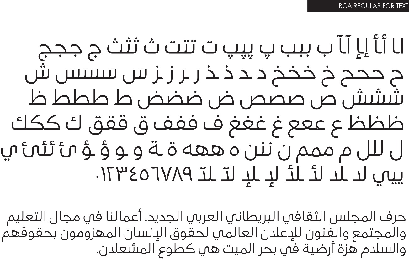
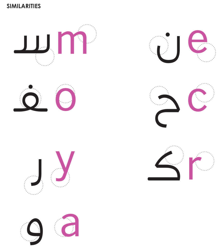
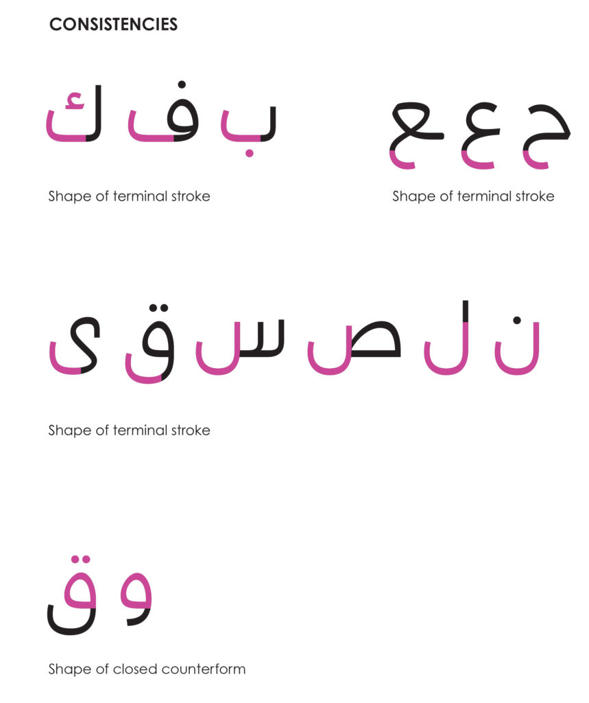
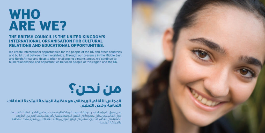
The goal is to balance legibility with the Latin British Council font. As type is an essential part of the visual identity of a corporate brand, our team has worked closely with you to develop a tailormade match for the Latin counterpart, focusing mainly on three major characteristics:
Client /
British Council
Location /
London
Year /
2016
1- Legibility: Each character on its own must be easily recognisable.
2- Versatility: Having the ability to function on both text and headline platforms.
3- Modernity: The design should look simple, clean and most importantly neutral.